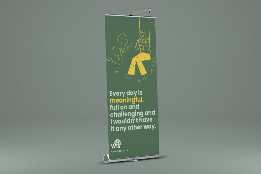
Whatever It Takes Community Services
Client
Work
Brief
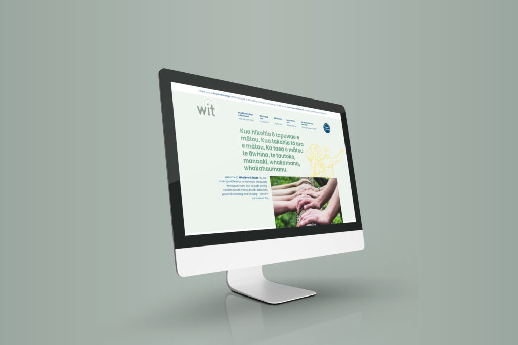
Hawkes Bay charity, Whatever It Takes, do incredible work across a huge range of social services. From mental health and addiction, to personal wellbeing and housing. Those they support need fast, barrier-free help. They asked us to build a very accessible website.
The objectives
He Tangata, He Tangata, He Tangata.
The goal
Take a long list of services, write and design a customer centric online resource that works for those who need it most.
The process
A close collaboration with our content writer to ensure every word, title, and page started and finished with the needs of the people in mind.
The deliverables
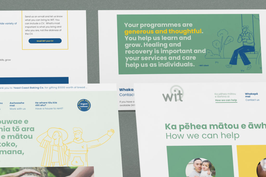
A Te Reo friendly website where english takes a supporting role.
Outcome
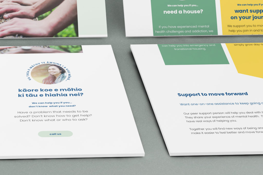
A site that helps people find what they need quickly, even when they don't really know what they looking for.
Simple graphics
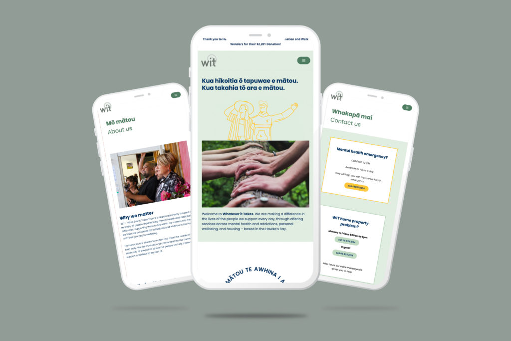
Easily downloadable for low data users and easily legible for mobile only use.
Streamlined content
Well structured content for easy searching and easy reading with contact information immediately accessible.
Barrier free
A website that resonates care, compassion and inclusion.
The goal
Essential reporting completed with a clear understanding of the corporate brand design requirements.
The Wonderlab Long Read on: Website optimisation
User Interface Design Considerations When Designing a Mobile-Friendly, Highly Accessible Web Site
• Start with Mobile: First and foremost, it’s important to design your website with mobile users in mind because the majority of web traffic now comes from mobile devices. Use responsive design principles to make sure your site looks great and works seamlessly across all screen sizes. Additionally, consider creating unique content for mobile users so they have an optimal browsing experience.
• Develop an Intuitive Navigation System: To make sure visitors can easily find what they’re looking for, design a clear and intuitive navigation system. Strive for simplicity rather than complexity – use category pages and drop down menus to organize your content logically. Additionally, make sure your search and contact forms are easy to understand and complete.
• Leverage Appropriate Color Schemes: Colors play a major role in setting the tone of a web site, so it’s important to pick the right hues when designing yours. Choose colors that contrast well with each other and create enough contrast between foreground and background elements to ensure readability. Moreover, be mindful of color blindness when selecting palettes, as certain combinations can be unreadable or confusing for those with impaired vision.
• Include Alt Text for Images: In order to make your site accessible to blind and visually impaired visitors, it’s important to include alt text descriptions alongside all images. This way, people using screen readers can understand the context behind each image more easily. So don’t forget to add brief descriptive texts for all photos used on the site!
• Keep Load Times Low: Nobody likes slow loading times, so take steps to minimize page speed. Optimize large images for the web, reduce website redirects, consolidate external scripts into one file, and use a CDN service (content delivery network) if needed. As these measures help ensure faster download speeds, they also result in improved user experience and increased conversion rates.
• Utilize CSS Animations Sparingly: Animations not only enhance a website’s visual appeal but can also provide useful feedback when used sparingly. However, if abused, animations cause Distraction overload which makes the website less usable and difficult to access. Therefore, it’s important to selectively use animation effects and avoid overloading your visitors with too much activity at once.
• Test Your Site Regularly: Last but not least, always test your website prior to launch. Run various tests (manual & automated) to check UI elements such as buttons, links, forms etc., verify that all functions work correctly, and make sure fonts render properly on different platforms & browsers. Conducting regular tests will help catch any bugs & errors before putting the site live!
